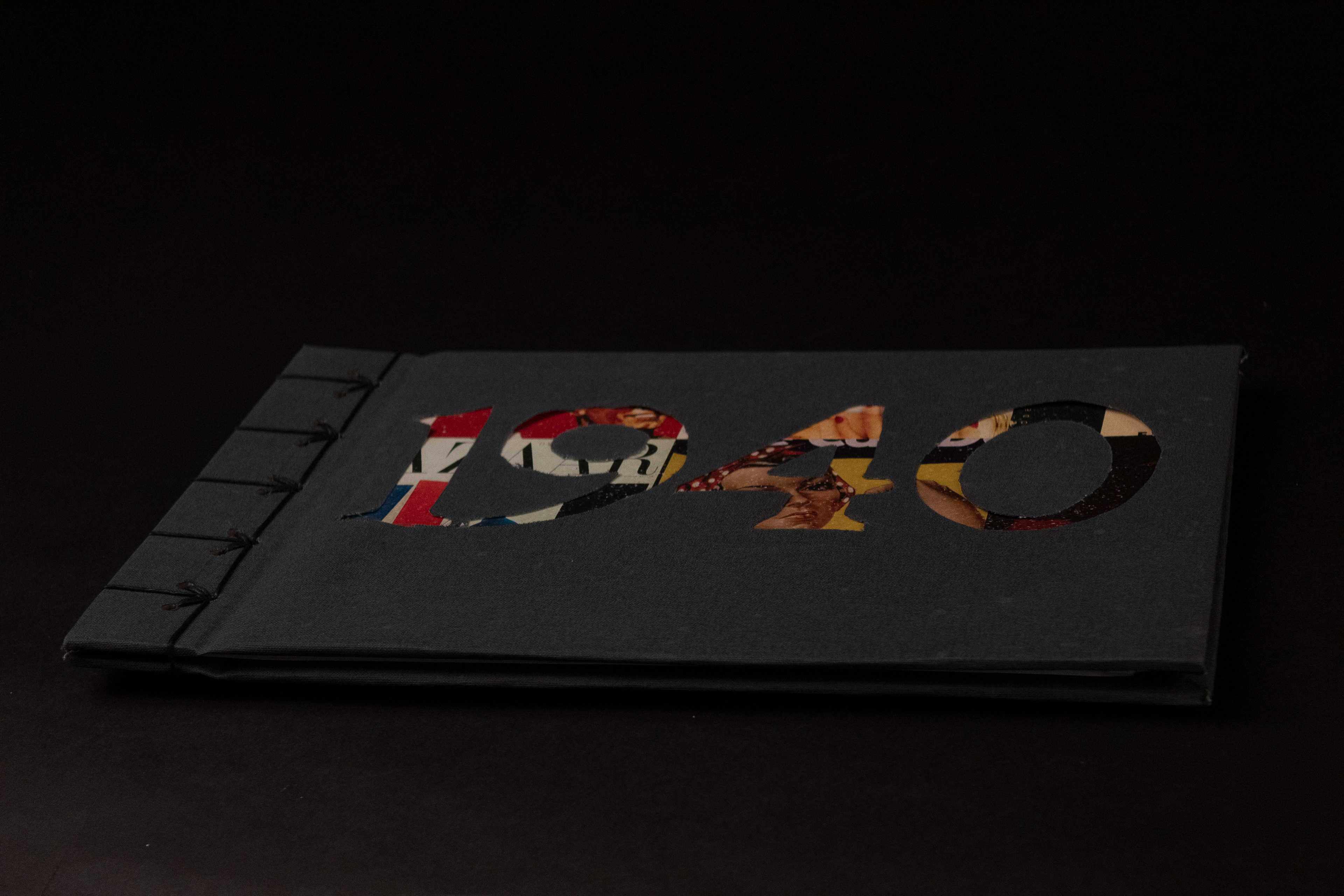
1940s Research Project
I was assigned to research design during the decade of WWII. I know a lot about the war, and the 40s is one of my favorite decades, so this was an exciting project.
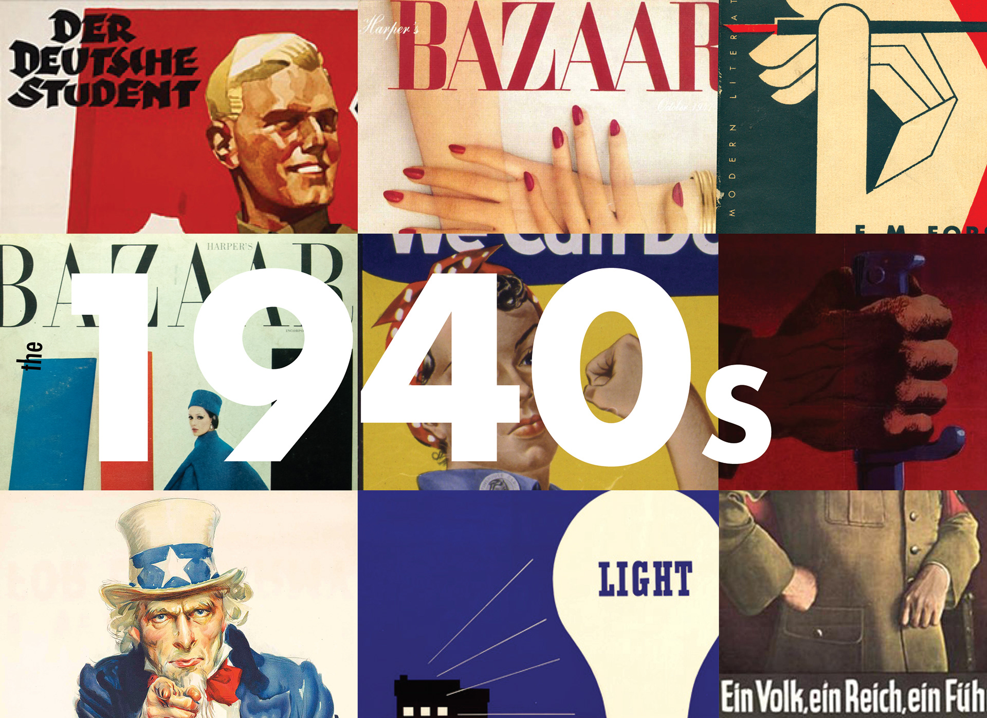
The 40’s
The 1940’s were a time of war, prosperity, poverty, and change. Not only did we see changes in the world itself, but we also saw a change in art. We see the beginnings of American Modernism, a revolution of design in Nazi Germany, use of political propaganda on both sides of the war, and the rise of International Typographic Style. But beyond that, popular artists had opportunities to make changes and move all over the world. So herein lies a question, how did art evolve in the 40’s? The simple answer, it didn’t. There was just not enough time during the war for art to make any major developments. It is unfortunate that such an evolving decade did not produce many new developments in art. And while the 1940’s may not have been a boom in development of type, typefaces, or printing, but the technology developed during the war paved a path for the future.
Let’s first take a look at a brief history of the 1940’s. In order to be able to explain the reasons as to why graphic design didn’t make too many leaps and bounds in the 40’s, we must understand what was going on during the decade, half of which was occupied by war. World War II began in 1939, and ended in 1941. The war spanned all areas of the world, and involved numerous countries, including the US, Japan, Britain, German, Japan, and Italy, all of whom have extensive involvement in art movements. Germany, of course well known for the Bauhaus, saw a drastic drop in artistic accomplishments during the war. The Bauhaus was closed by the Nazis in 1933. This was due to Adolf Hitler’s tyrant rule and enforcement over public works. Artists such as Laszlo Moholy-Nagy and Ludwiug Mies van der Rohe both moved to Chicago before the war broke out. Unfortunately, as two of the most influential artists of the Bauhaus, Germany lost an extensive place in the art world for the years to come. It was however, because of this, that we see America rising into the art scene with Modernism.
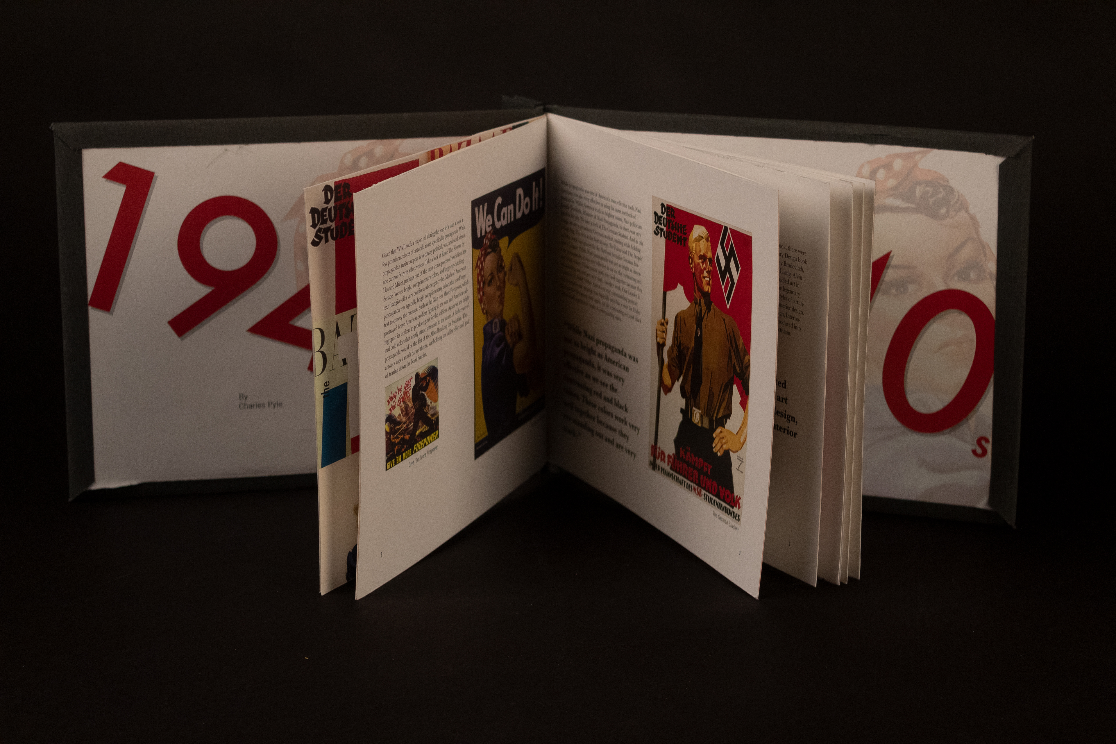
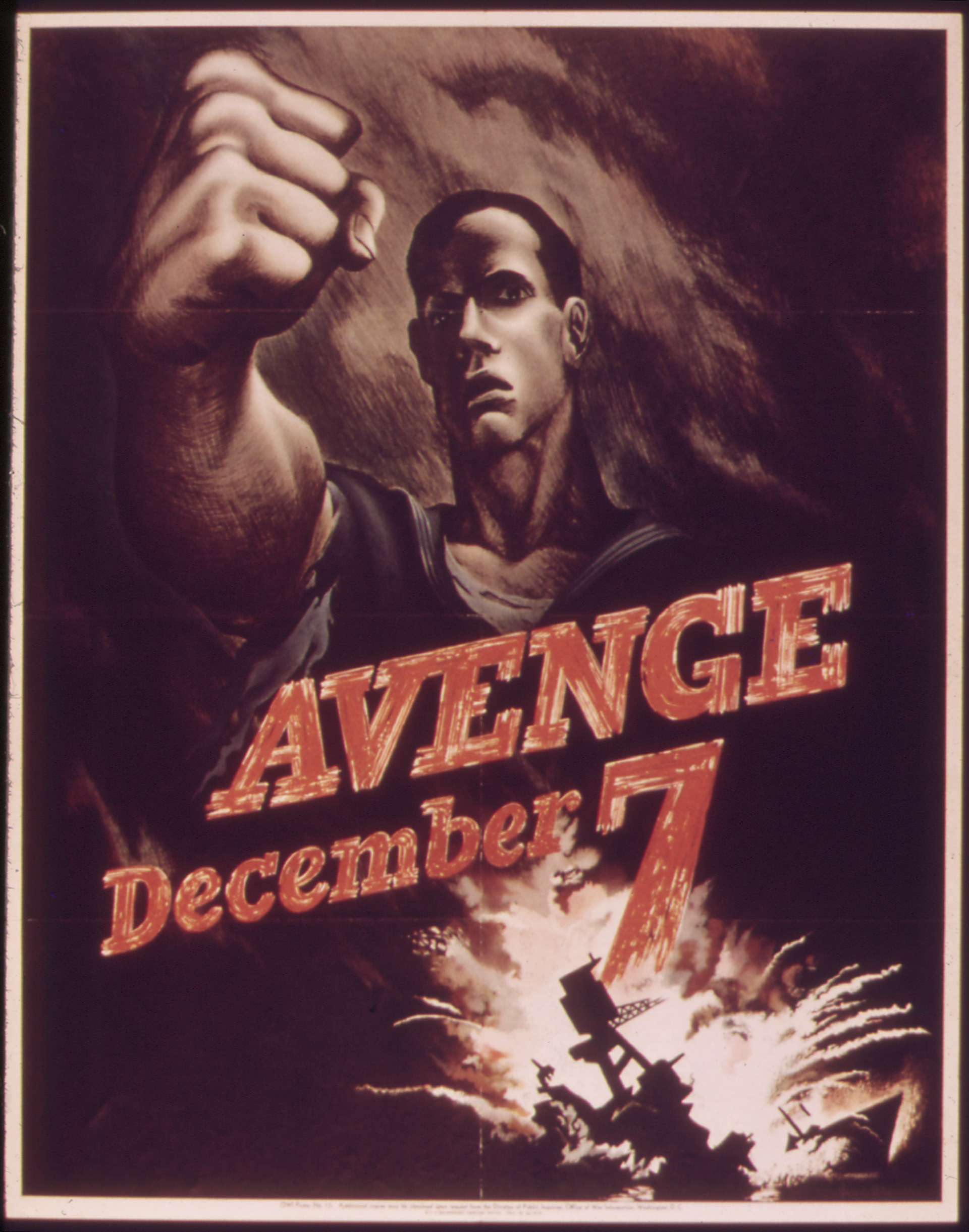
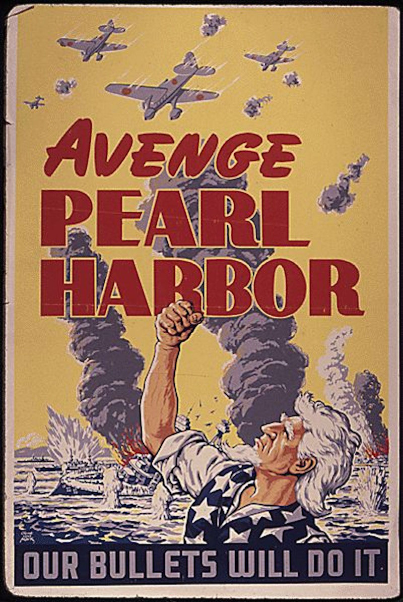
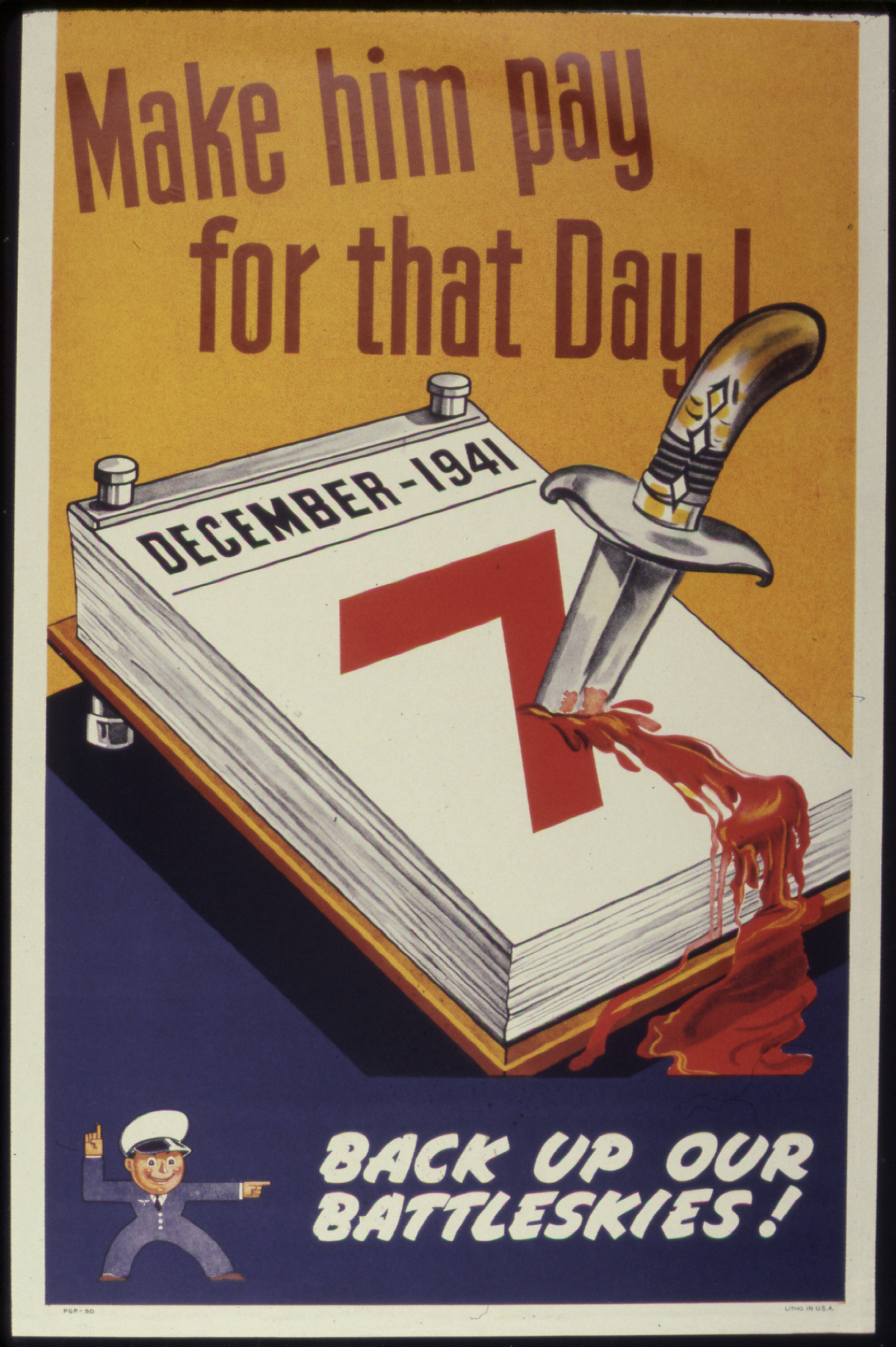
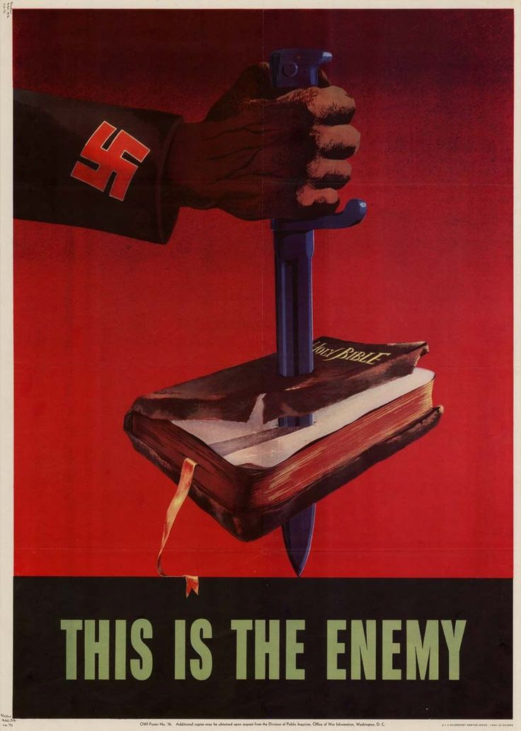
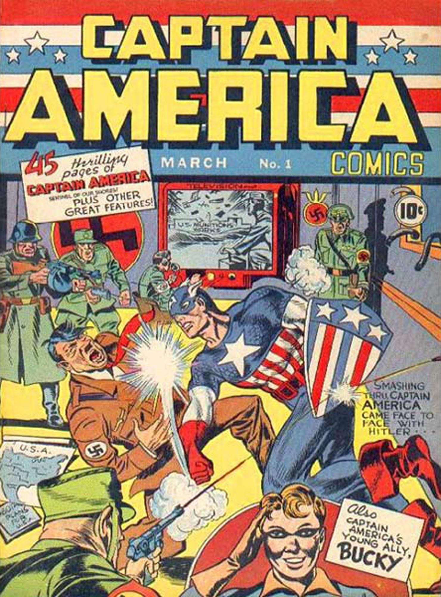
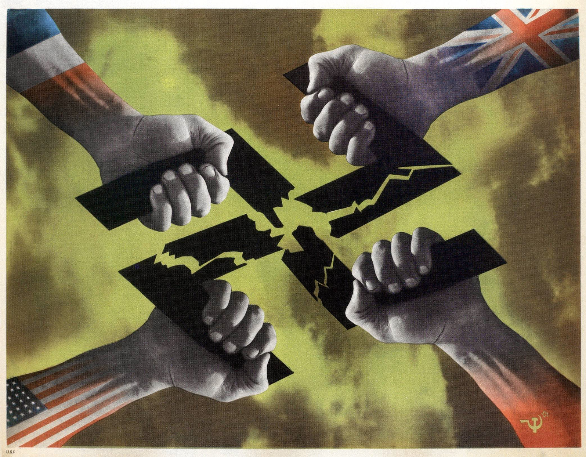
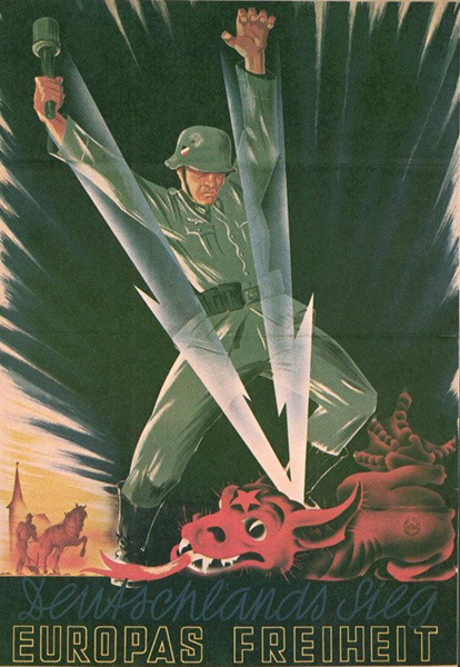
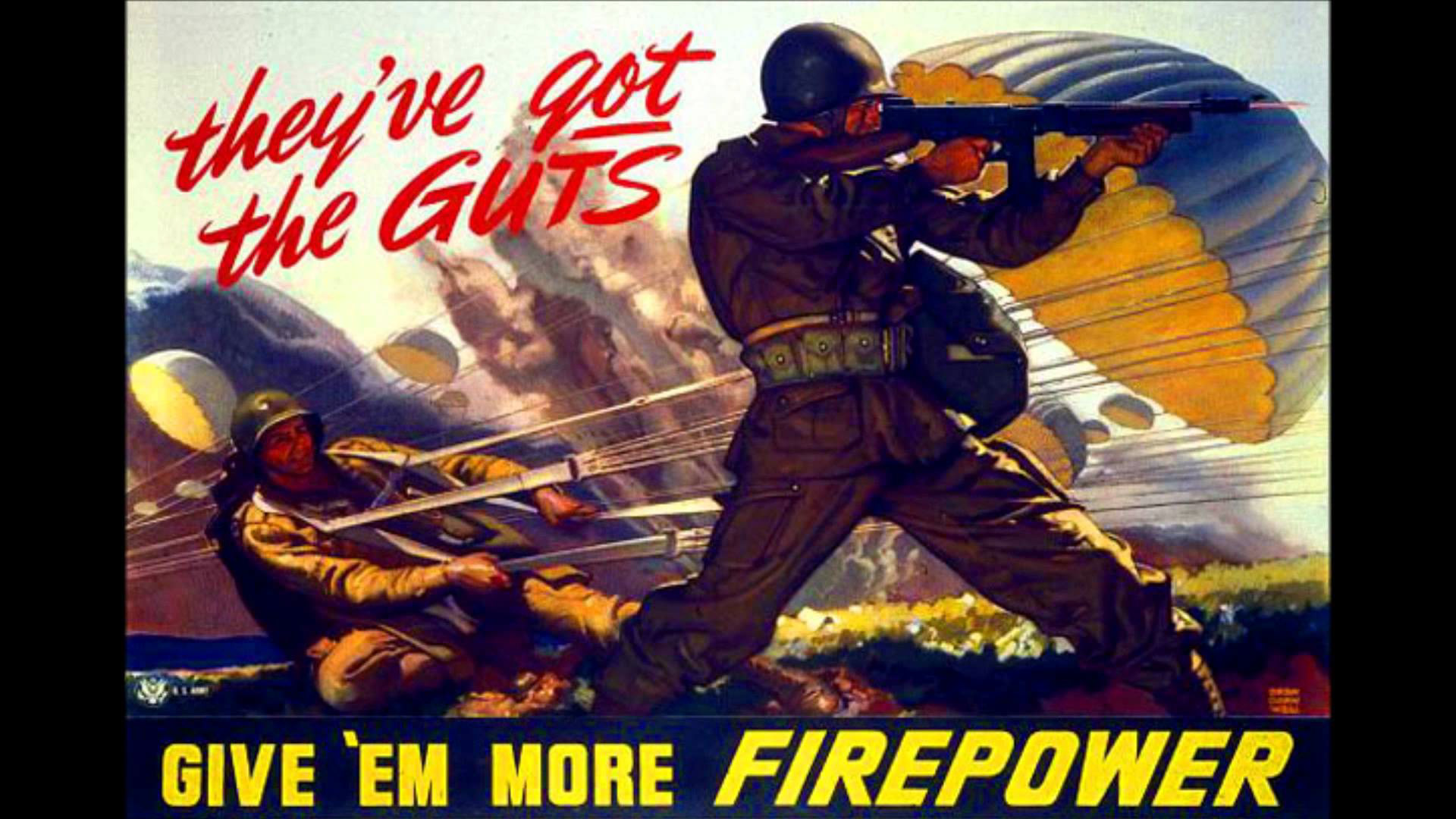
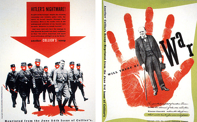
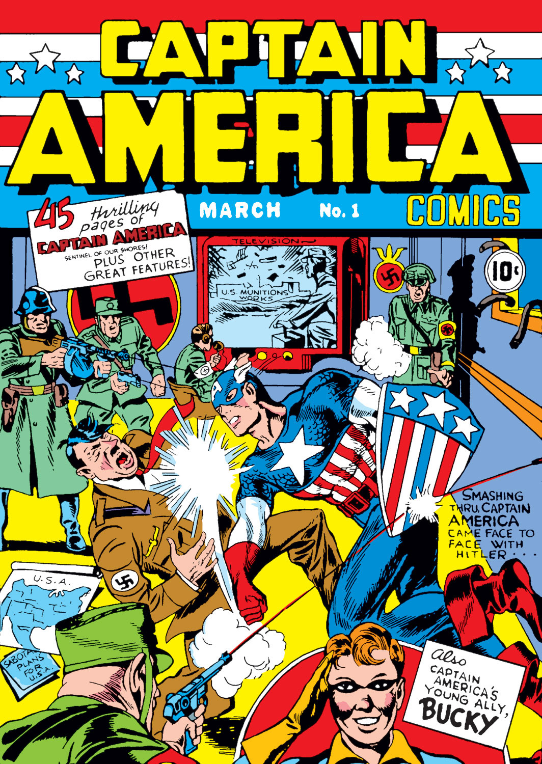
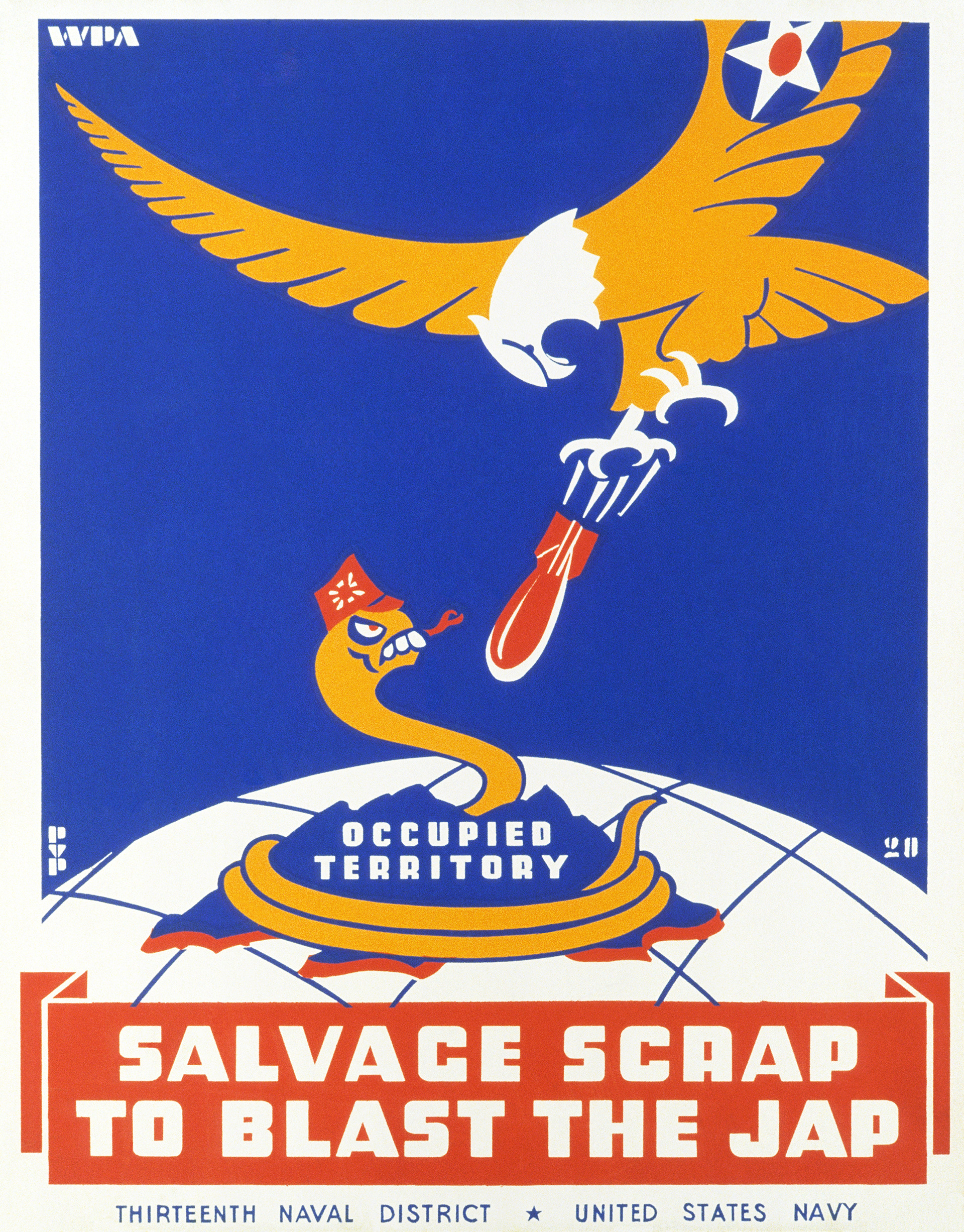
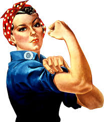
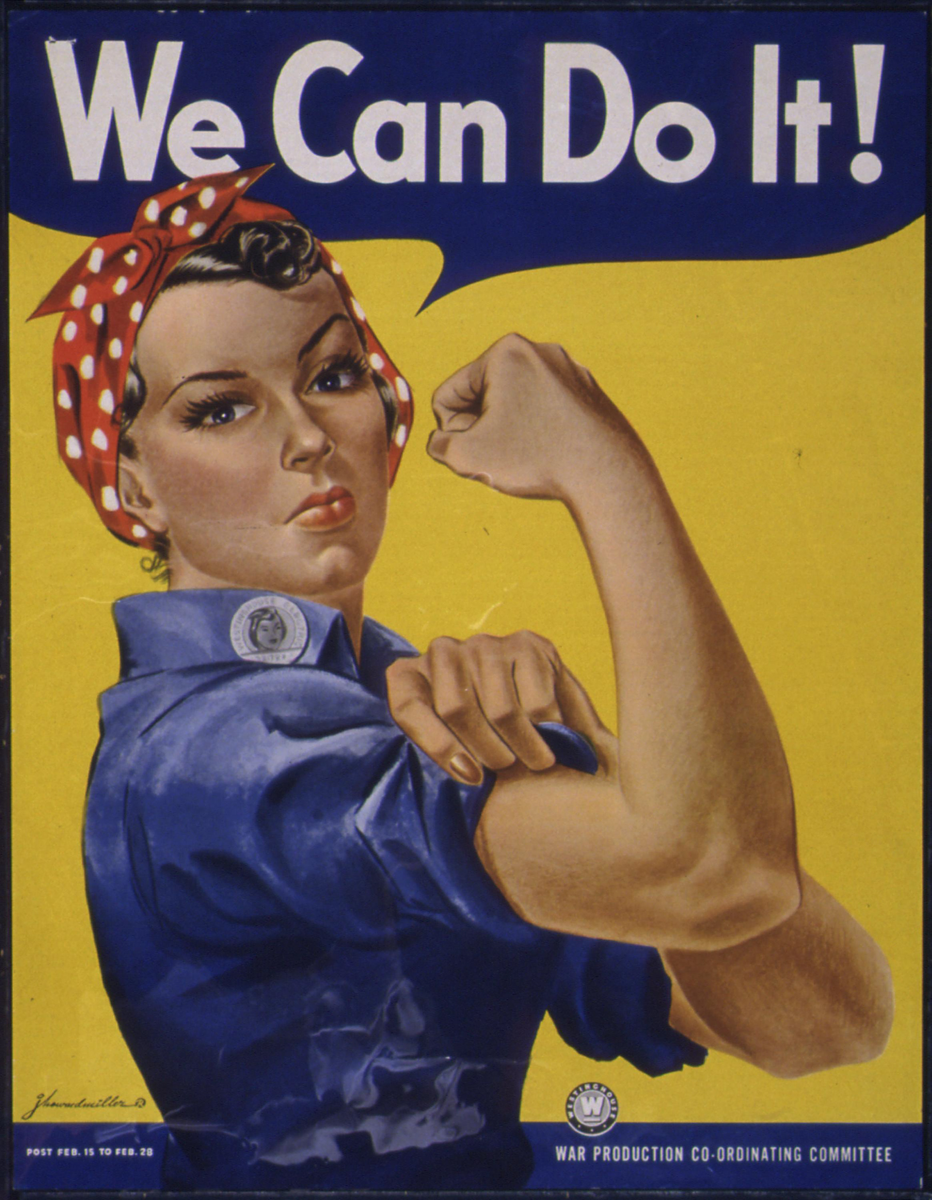
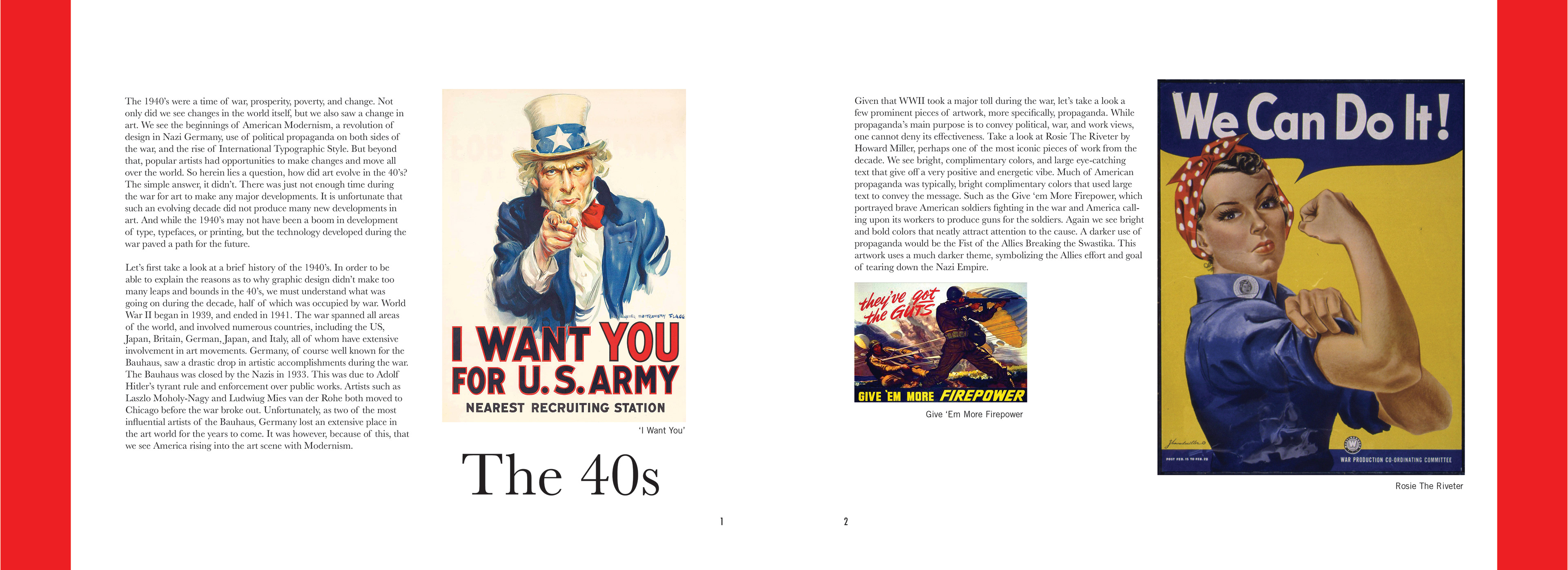
Given that WWII took a major toll during the war, let’s take a look a few prominent pieces of artwork, more specifically, propaganda. While propaganda’s main purpose is to convey political, war, and work views, one cannot deny its effectiveness. Take a look at Rosie The Riveter1 by Howard Miller, perhaps one of the most iconic pieces of work from the decade. We see bright, complimentary colors, and large eye-catching text that give off a very positive and energetic vibe. Much of American propaganda was typically, bright complimentary colors that used large text to convey the message. Such as the Give ‘em More Firepower2, which portrayed brave American soldiers fighting in the war and America calling upon its workers to produce guns for the soldiers. Again we see bright and bold colors that neatly attract attention to the cause. A darker use of propaganda would be the Fist of the Allies Breaking the Swastika3. This artwork uses a much darker theme, symbolizing the Allies effort and goal of tearing down the Nazi Empire.
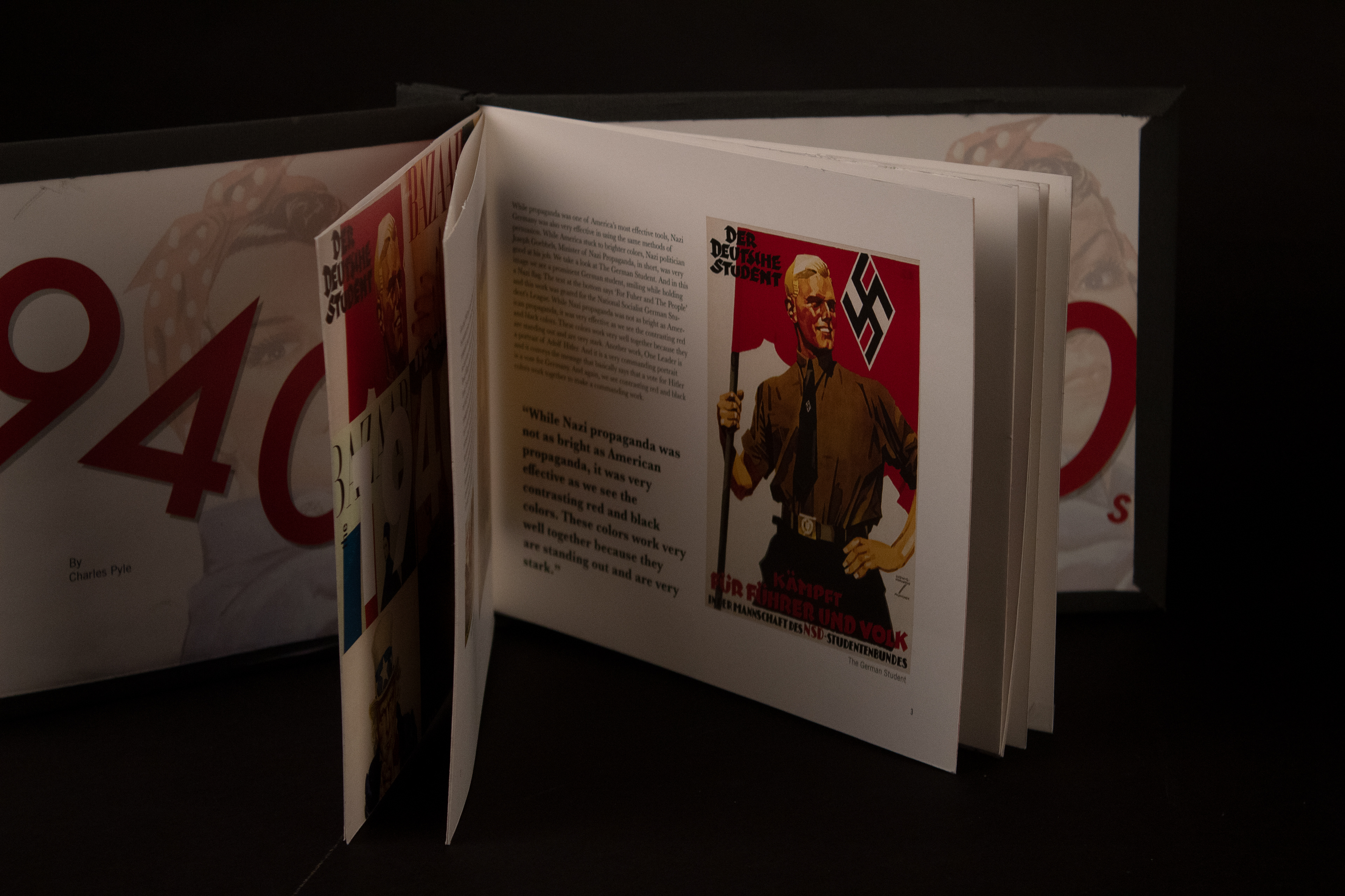
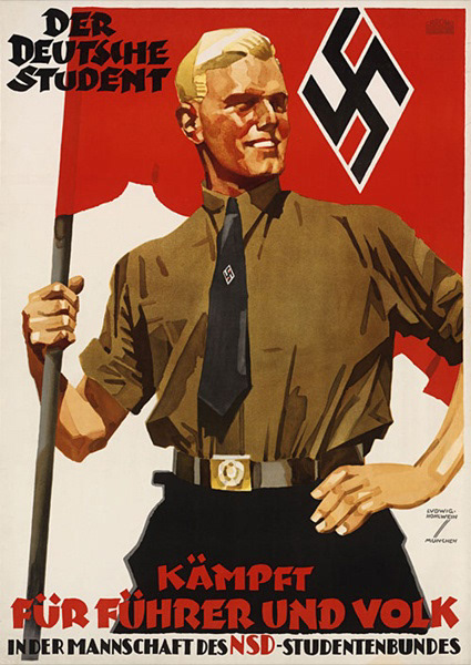
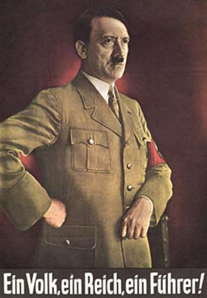
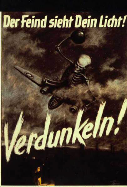
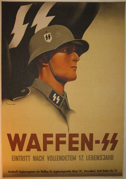
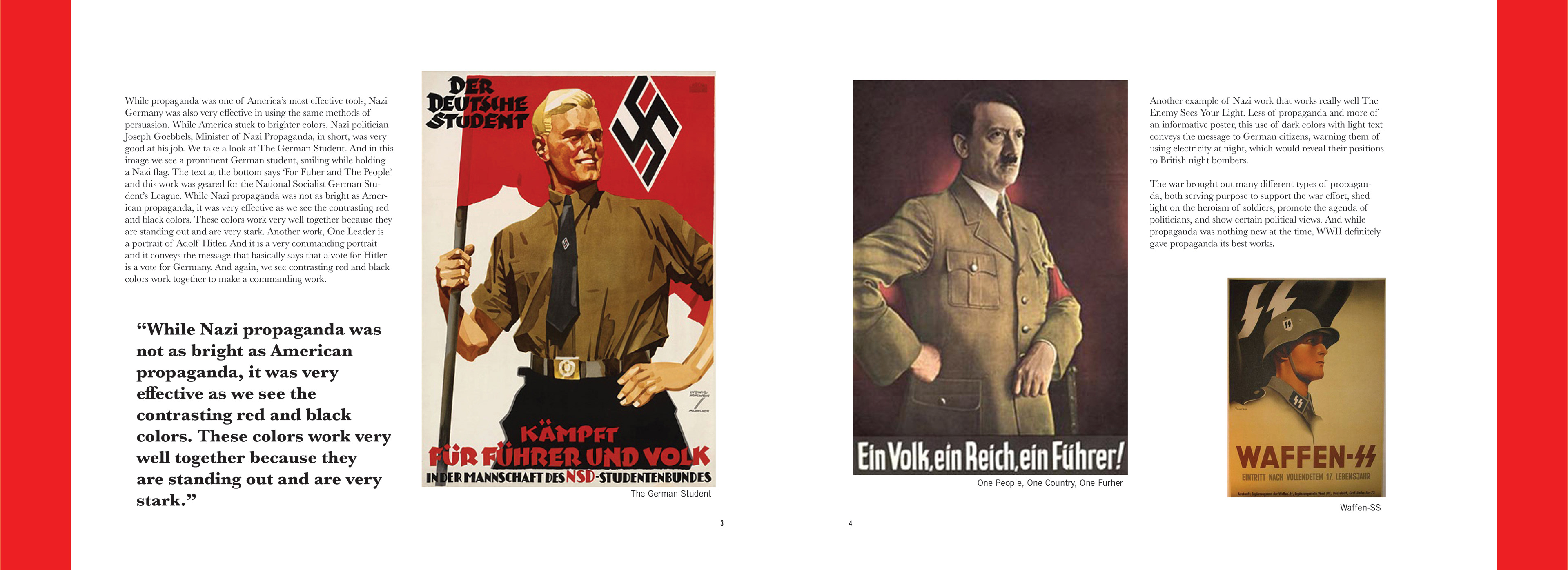
While propaganda America’s most effective tools, however, Nazi Germany was very effective in using the same tool. While America stuck to brighter colors, Nazi politician Joseph Goebbels, Minister of Nazi Propaganda, in short, was very good at his job. We take a look at The German Student4. And in this image we see a prominent German student, smiling while holding a Nazi flag. The text at the bottom says ‘For Fuher and The People’ and this work was geared for the National Socialist German Student’s League. While Nazi propaganda was not as bright as American propaganda, it was very effective as we see the contrasting red and black colors. These colors work very well together because they are standing out and are very stark. Another work, One Leader5 is a portrait of Adolf Hitler. And it is a very commanding portrait and it conveys the message that basically says that a vote for Hitler is a vote for Germany. And again, we see contrasting red and black colors work together to make a commanding work. Another example of Nazi work that works really well The Enemy Sees Your Light6. Less of propaganda and more of an informative poster, this use of dark colors with light text conveys the message to German citizens, warning them of using electricity at night, which would reveal their positions to British night bombers.
The war brought out many different types of propaganda, both serving purpose to support the war effort, shed light on the heroism of soldiers, promote the agenda of politicians, and show certain political views. And while propaganda was nothing new at the time, WWII definitely gave propaganda its best work7,8,9.
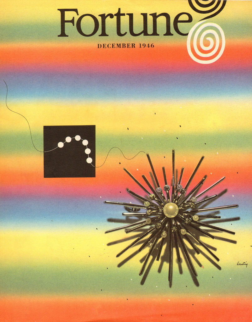
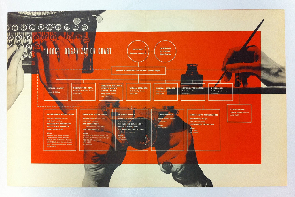
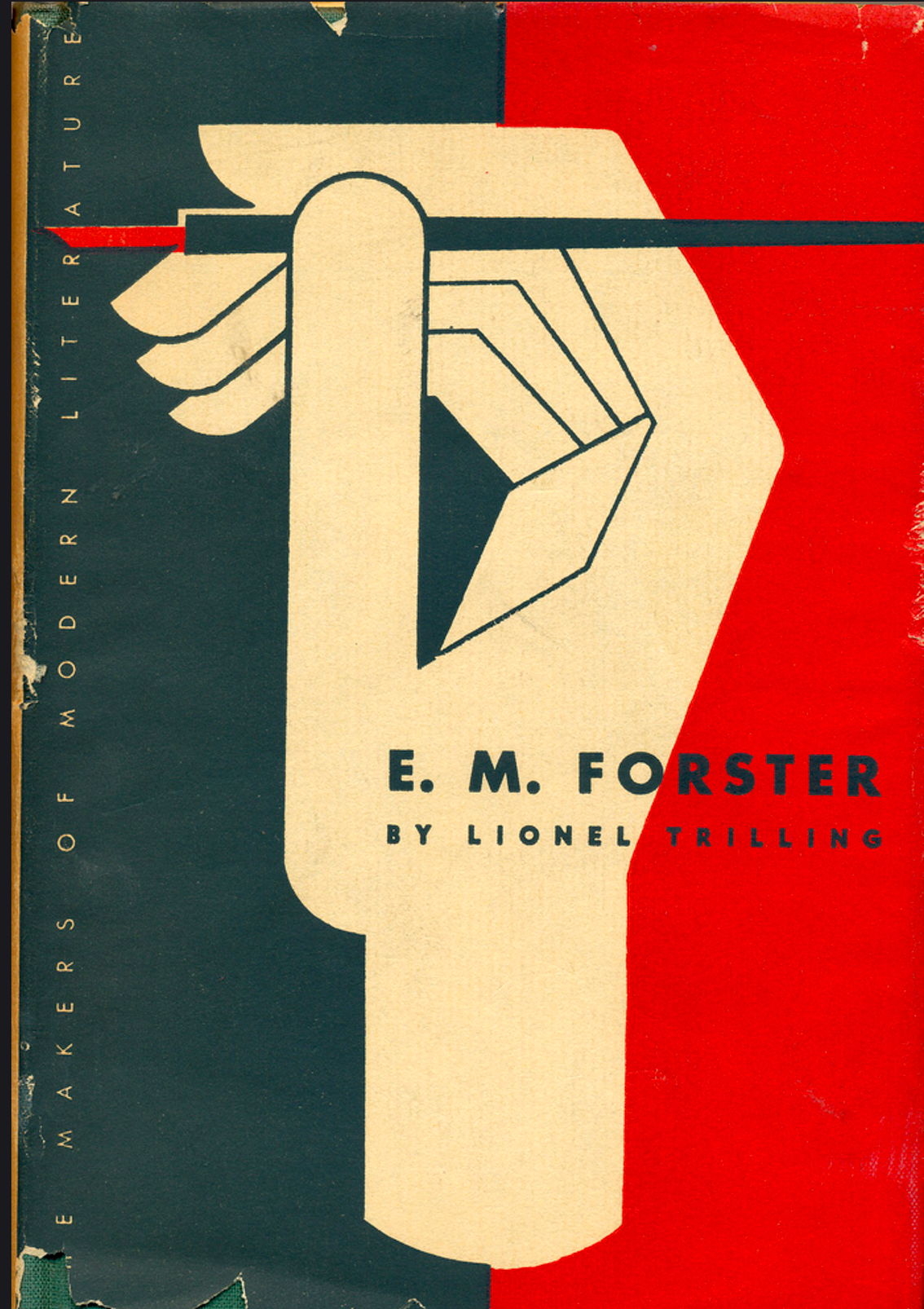
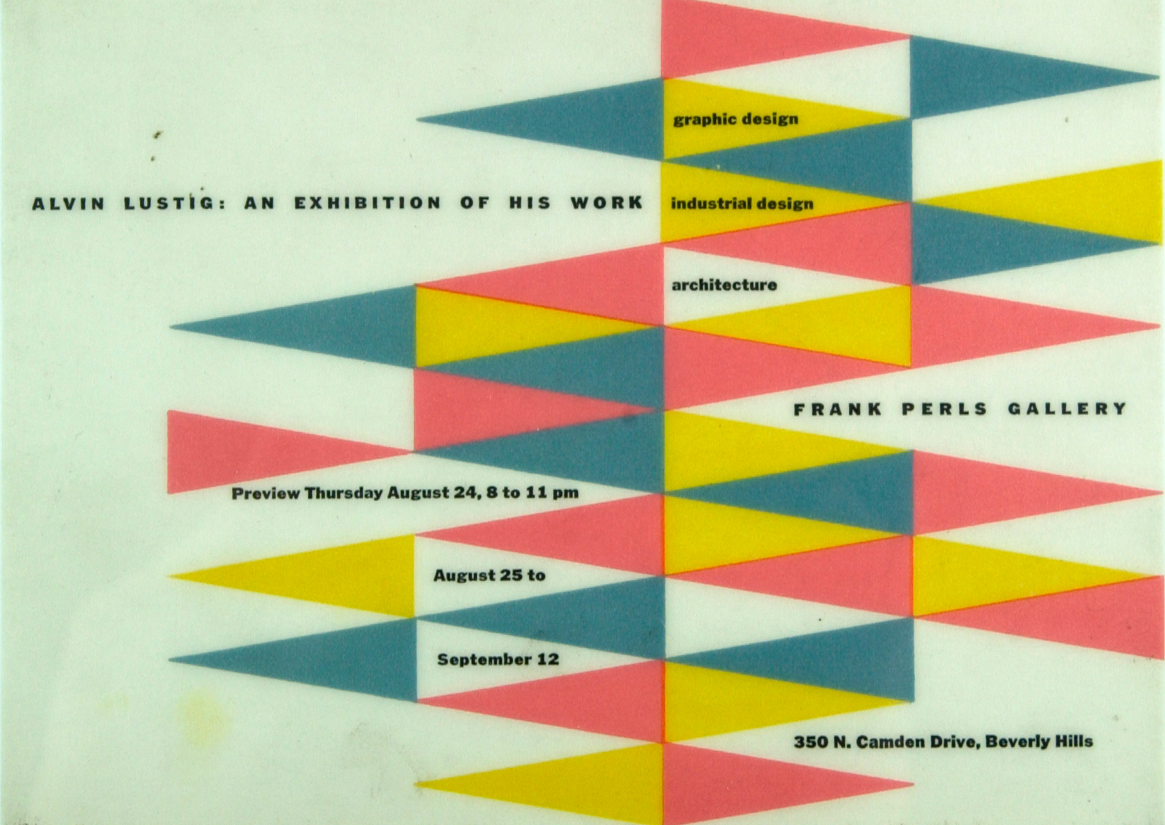
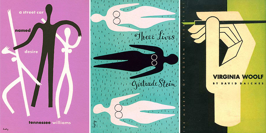
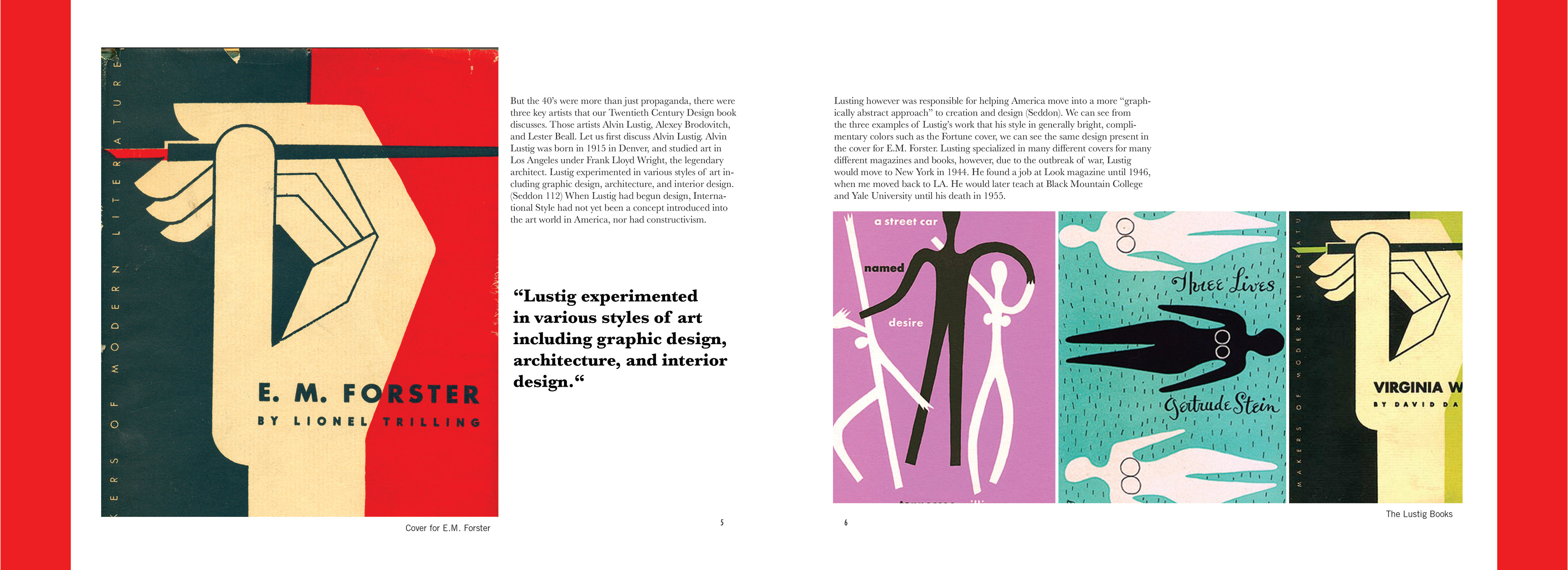
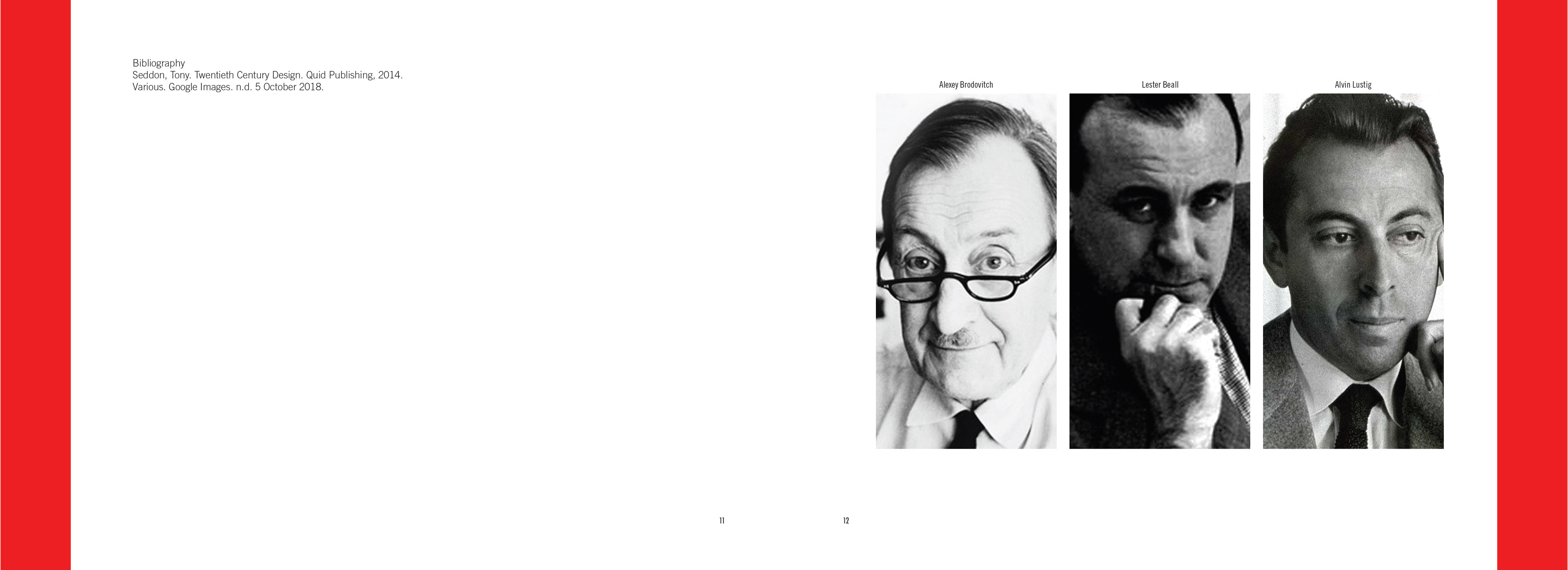
But the 40’s were more than just propaganda, there were three key artists that our Twentieth Century Design book discusses. Those artists Alvin Lustig, Alexey Brodovitch, and Lester Beall. Let us first discuss Alvin Lustig. Alvin Lustig was born in 1915 in Denver, and studied art in Los Angeles under Frank Lloyd Wright, the legendary architect. Lustig experimented in various styles of art including graphic design, architecture, and interior design. (Seddon 112) When Lustig had begun design, International Style had not yet been a concept introduced into the art world in America, nor had constructivism. Lusting however was responsible for helping America move into a more “graphically abstract approach” to creation and design (Seddon). We can see from the three examples of Lustig’s work that his style in generally bright, complimentary colors such as the Fortune cover10, we can see the same design present in the cover for E.M. Forster11. Lusting specialized in many different covers for many different magazines and books, however, due to the outbreak of war, Lustig would move to New York in 1944. He found a job at Look magazine until 1946, when me moved back to LA. He would later teach at Black Mountain College and Yale University until his death in 1955.
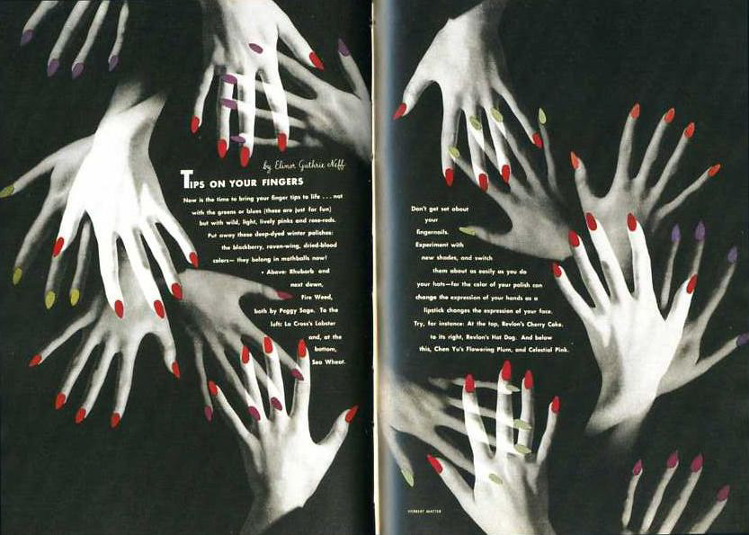
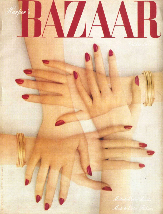
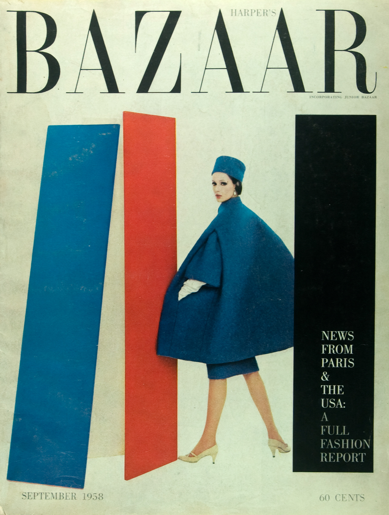
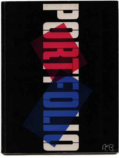
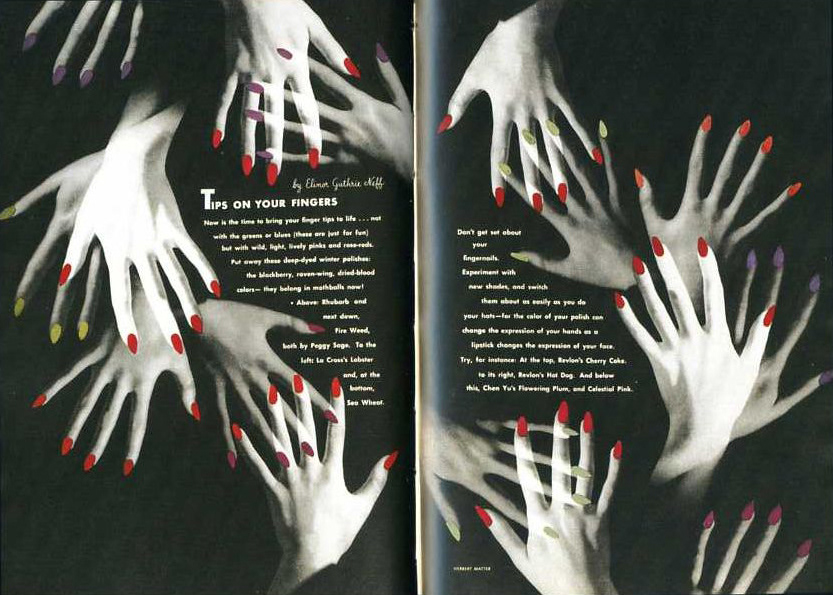
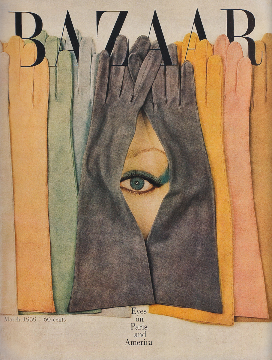
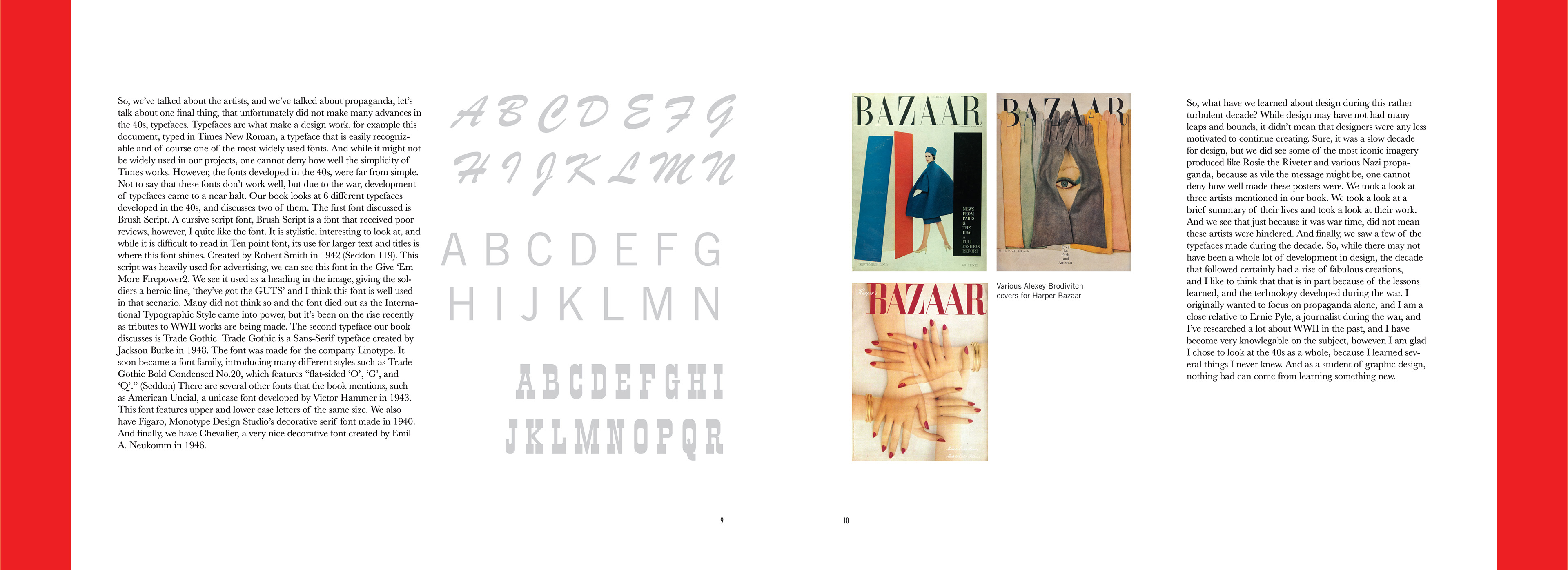
Another artist I will discuss is Alexey Brodovitch. A Russian artist, born in 1898, Alexey would become one of the great’s when it came to magazines. Take a look at his 1947 cover for Harper Bazaar12, we see a very unique use of the human hand and a fantastic use of transparency to communicate a shape. The colors are warm, and eye-catching and the image plays nicely with the text of the magazine name. And this was not the first time Bodovitch used hands in his work. In an earlier spread for the same magazine in 194113, he used multiple hands, all with red nails, similar to the 1947 cover. The biggest difference is the use of a black background and white hands, with the nails being the only color on the spread. It is a beautiful design and is in stark contrast to the brighter 1947 cover. Alexey began his career in Paris, during the 1920s where he would work for various magazines until he returned to Russia. He would move to the US in 1930 and stayed there during the war. In 1950, Brodovitch developed a cover for Portfolio magazine,14 which is “considered an important benchmark in the history of magazine publishing”. (Seddon 115) Brodovitch made a career with Harper Bazaar, and worked there for 24 years until 1958, when he returned to France, where he stayed until his passing in 1971.
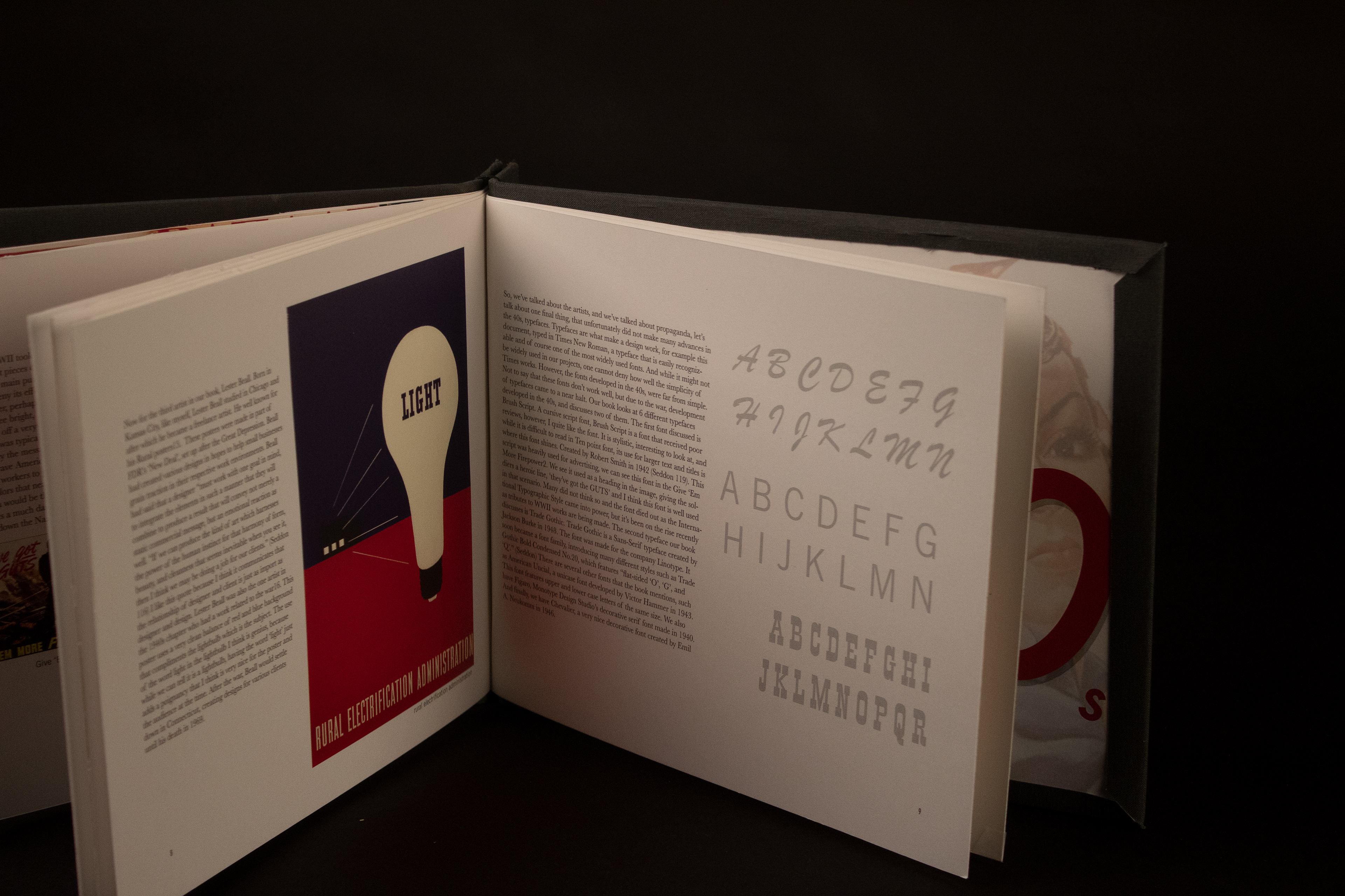
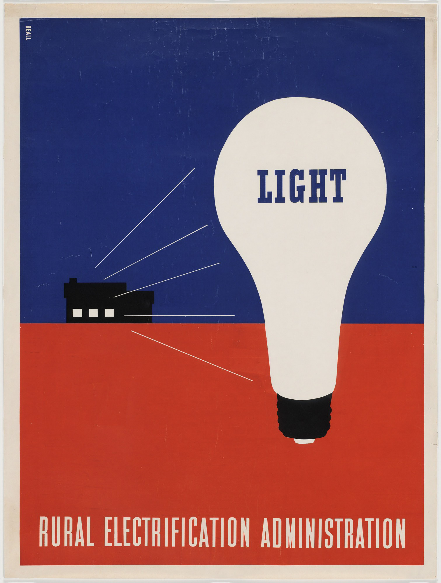
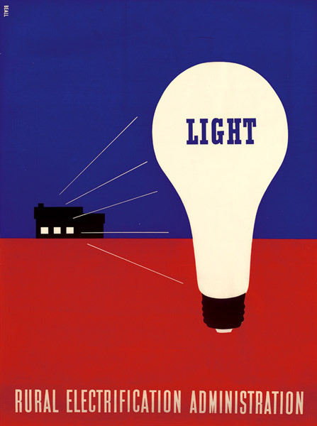
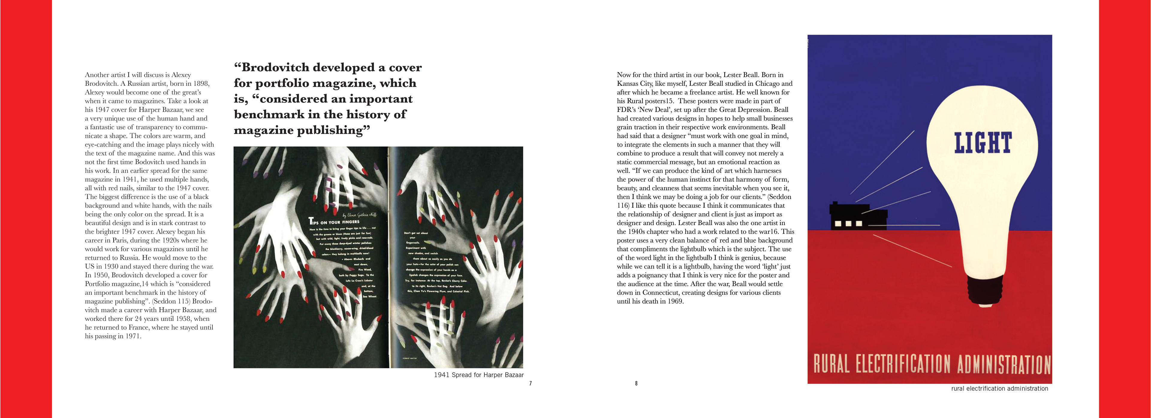
Now for the third artist in our book, Lester Beall. Born in Kansas City, like myself, Lester Beall studied in Chicago and after which he became a freelance artist. He well known for his Rural posters15. These posters were made in part of FDR’s ‘New Deal’, set up after the Great Depression. Beall had created various designs in hopes to help small businesses grain traction in their respective work environments. Beall had said that a designer “must work with one goal in mind, to integrate the elements in such a manner that they will combine to produce a result that will convey not merely a static commercial message, but an emotional reaction as well. If we can produce the kind of art which harnesses the power of the human instinct for that harmony of form, beauty, and cleanness that seems inevitable when you see it, then I think we may be doing a job for our clients.” (Seddon 116) I like this quote because I think it communicates that the relationship of designer and client is just as import as designer and design. Lester Beall was also the one artist in the 1940s chapter who had a work related to the war16. This poster uses a very clean balance of red and blue background that compliments the lightbulb which is the subject. The use of the word light in the lightbulb I think is genius, because while we can tell it is a lightbulb, having the word ‘light’ just adds a poignancy that I think is very nice for the poster and the audience at the time. After the war, Beall would settle down in Connecticut, creating designs for various clients until his death in 1969.
So, we’ve talked about the artists, and we’ve talked about propaganda, let’s talk about one final thing, that unfortunately did not make many advances in the 40s, typefaces. Typefaces are what make a design work, for example this document, typed in Times New Roman, a typeface that is easily recognizable and of course one of the most widely used fonts. And while it might not be widely used in our projects, one cannot deny how well the simplicity of Times works. However, the fonts developed in the 40s, were far from simple. Not to say that these fonts don’t work well, but due to the war, development of typefaces came to a near halt. Our book looks at 6 different typefaces developed in the 40s, and discusses two of them. The first font discussed is Brush Script. A cursive script font, Brush Script is a font that received poor reviews, however, I quite like the font. It is stylistic, interesting to look at, and while it is difficult to read in Ten point font, its use for larger text and titles is where this font shines. Created by Robert Smith in 1942 (Seddon 119). This script was heavily used for advertising, we can see this font in the Give ‘Em More Firepower2. We see it used as a heading in the image, giving the soldiers a heroic line, ‘they’ve got the GUTS’ and I think this font is well used in that scenario. Many did not think so and the font died out as the International Typographic Style came into power, but it’s been on the rise recently as tributes to WWII works are being made. The second typeface our book discusses is Trade Gothic. Trade Gothic is a Sans-Serif typeface created by Jackson Burke in 1948. The font was made for the company Linotype. It soon became a font family, introducing many different styles such as Trade Gothic Bold Condensed No.20, which features “flat-sided ‘O’, ‘G’, and ‘Q’.” (Seddon) There are several other fonts that the book mentions, such as American Uncial, a unicase font developed by Victor Hammer in 1943. This font features upper and lower case letters of the same size. We also have Figaro, Monotype Design Studio’s decorative serif font made in 1940. And finally, we have Chevalier, a very nice decorative font created by Emil A. Neukomm in 1946.
So, what have we learned about design during this rather turbulent decade? While design may have not had many leaps and bounds, it didn’t mean that designers were any less motivated to continue creating. Sure, it was a slow decade for design, but we did see some of the most iconic imagery produced like Rosie the Riveter and various Nazi propaganda, because as vile the message might be, one cannot deny how well made these posters were. We took a look at three artists mentioned in our book. We took a look at a brief summary of their lives and took a look at their work. And we see that just because it was war time, did not mean these artists were hindered. And finally, we saw a few of the typefaces made during the decade. So, while there may not have been a whole lot of development in design, the decade that followed certainly had a rise of fabulous creations, and I like to think that that is in part because of the lessons learned, and the technology developed during the war. I originally wanted to focus on propaganda alone, and I am a close relative to Ernie Pyle, a journalist during the war, and I’ve researched a lot about WWII in the past, and I have become very knowlegable on the subject, however, I am glad I chose to look at the 40s as a whole, because I learned several things I never knew. And as a student of graphic design, nothing bad can come from learning something new.
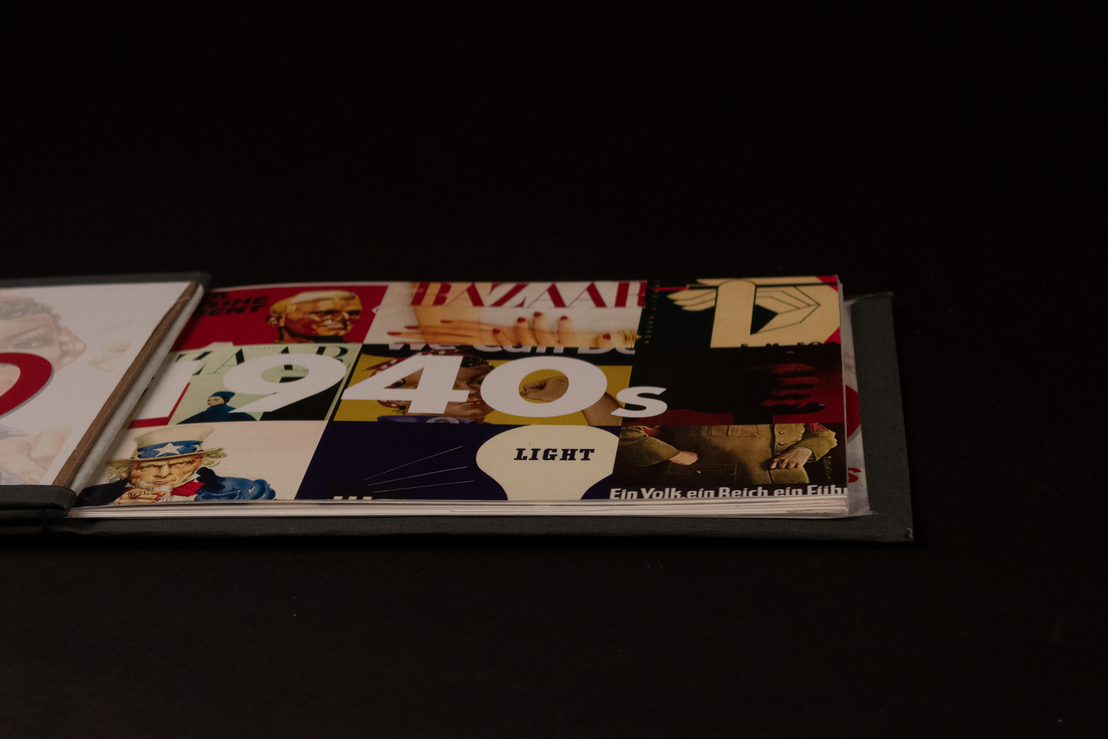
Below are the various images I referenced or relate to my research
After the research paper was complete, we went on to designing, and binding, which I was surprised at how much I enjoyed it.
And then the book.