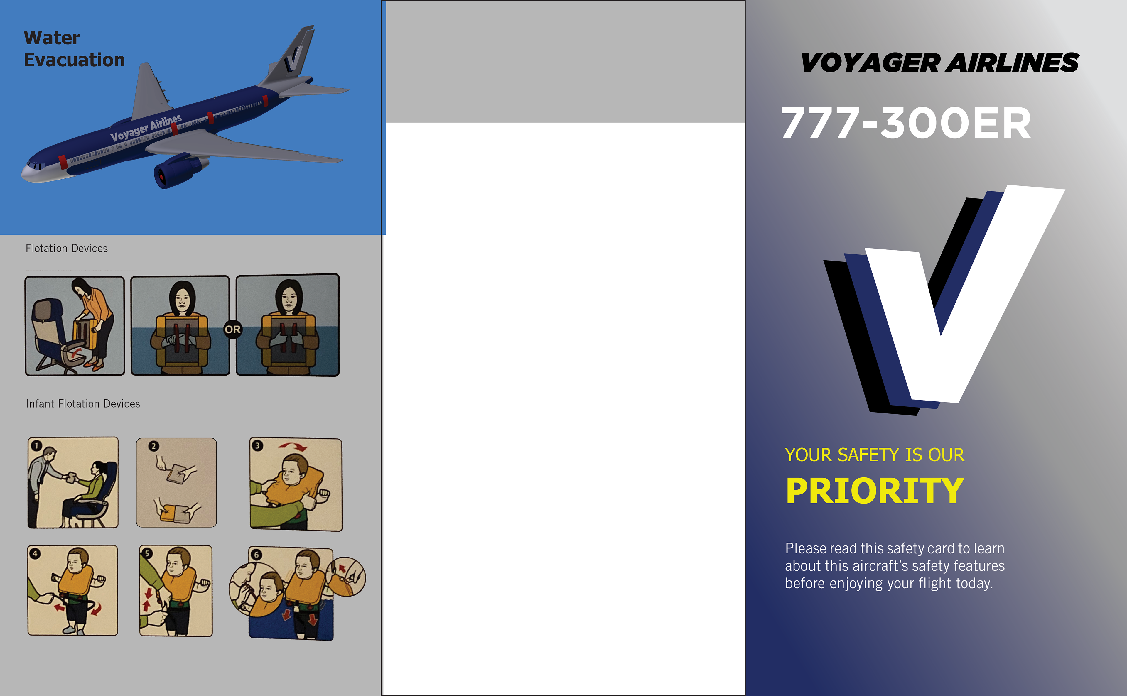
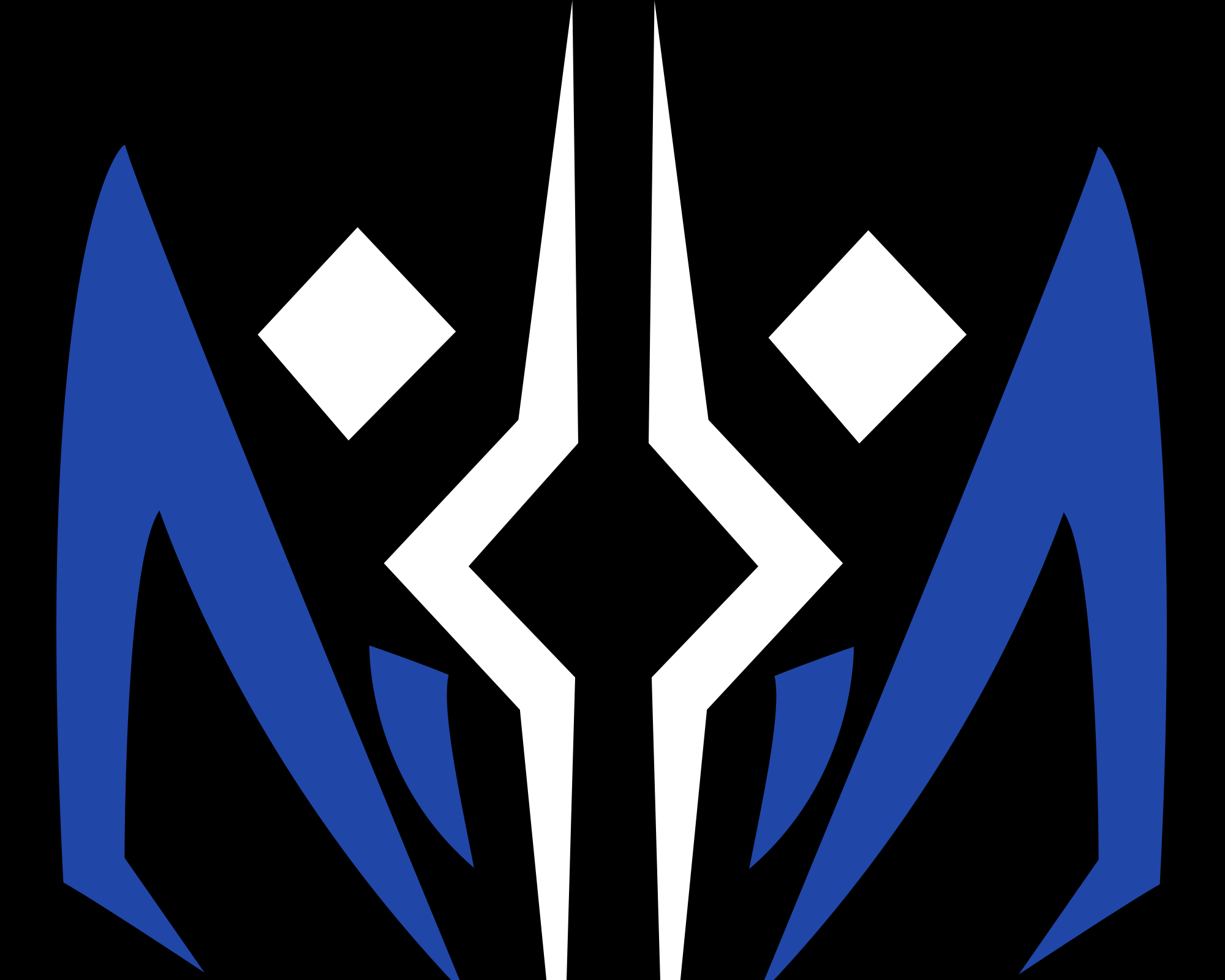
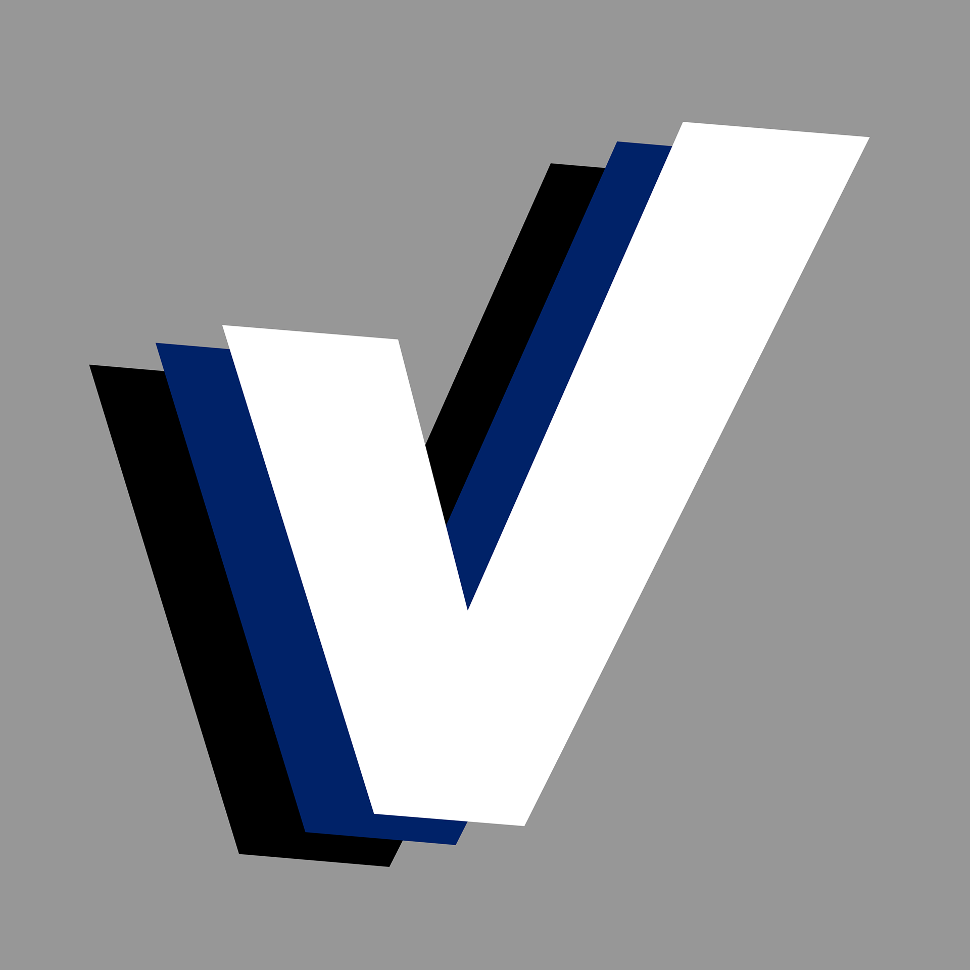
Perhaps one of my favorite projects, Voyager Airlines is a made up airline I designed. The idea behind the 'triple check v' was to show that Voyager Airlines' top priority is safety, as the airline triple checks everything before flying.
The model used for the livery is a Boeing 777. I used a combo of blues/whites and grays, which keeps surface controls (wings and tail) and the fuselage (the body), visible and eye catching.
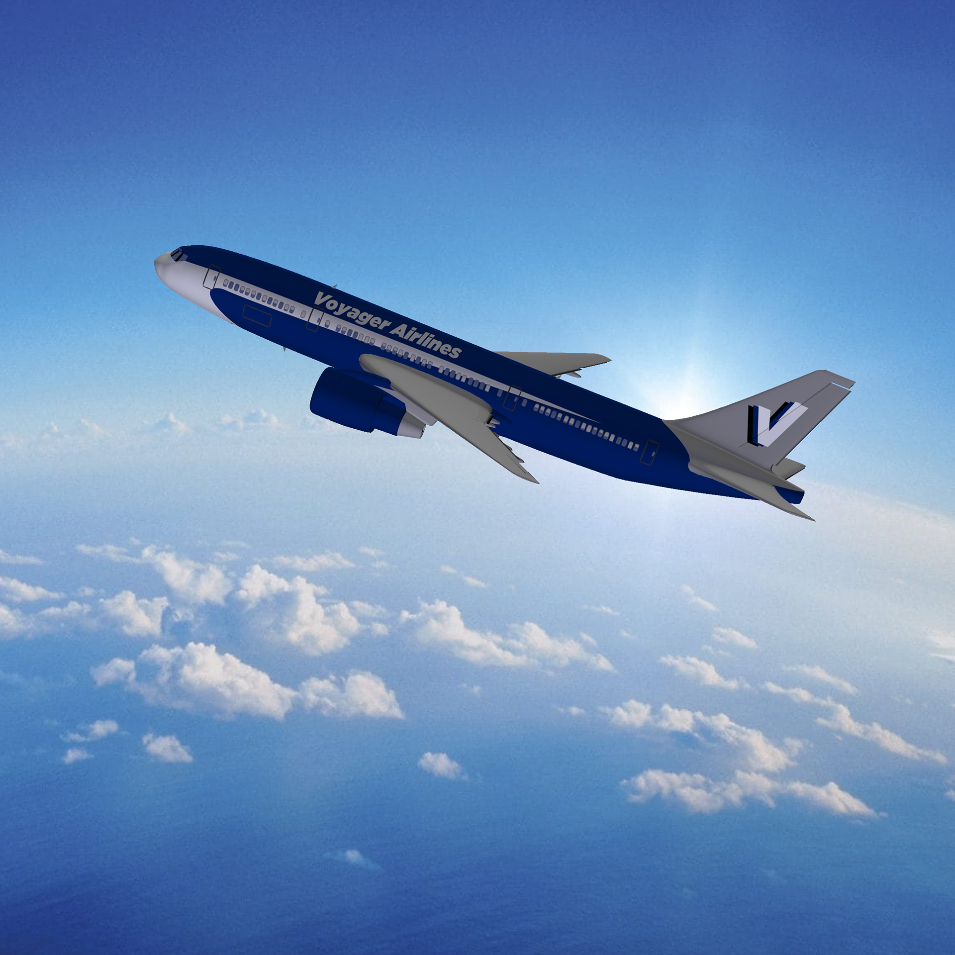


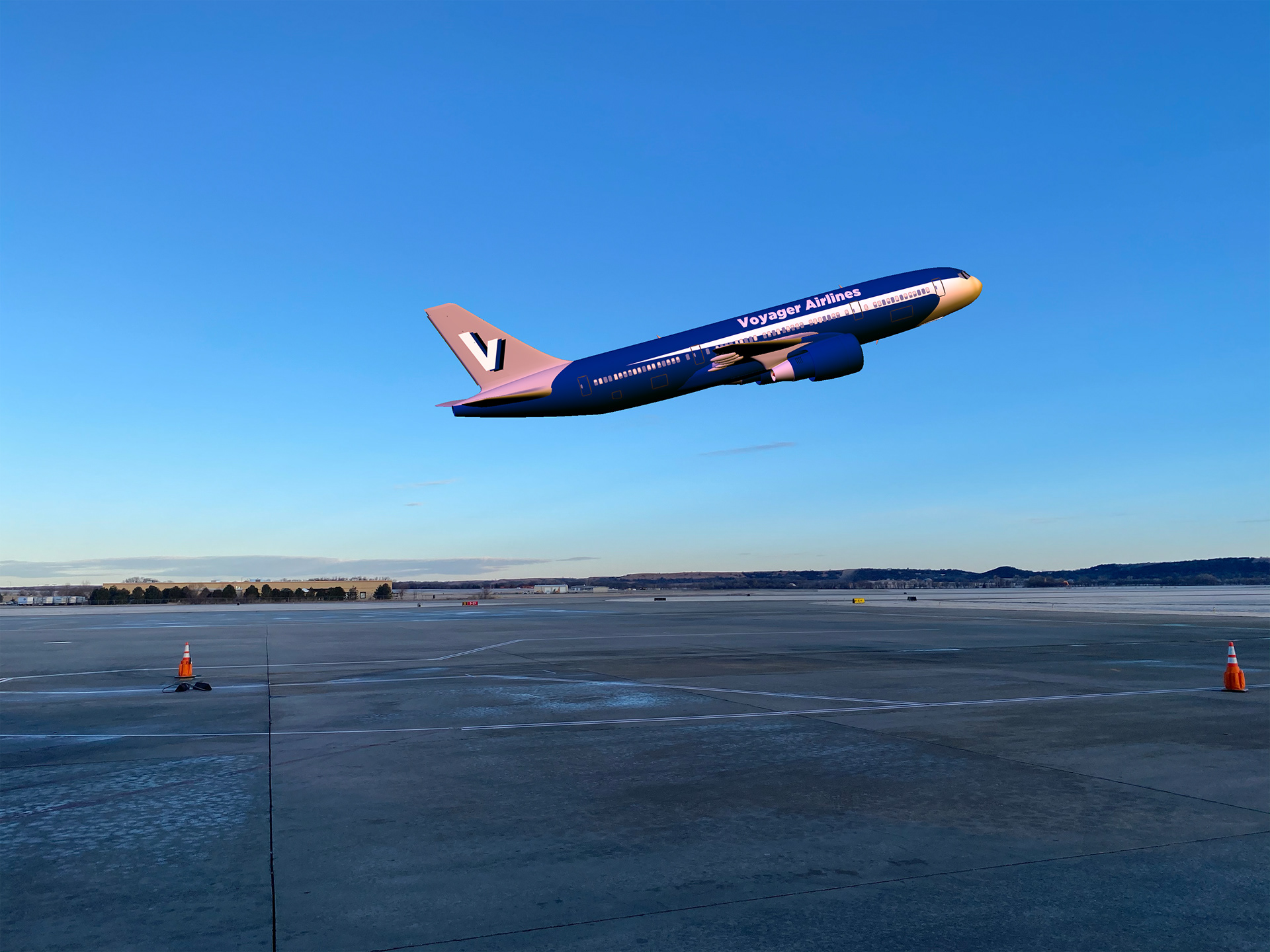
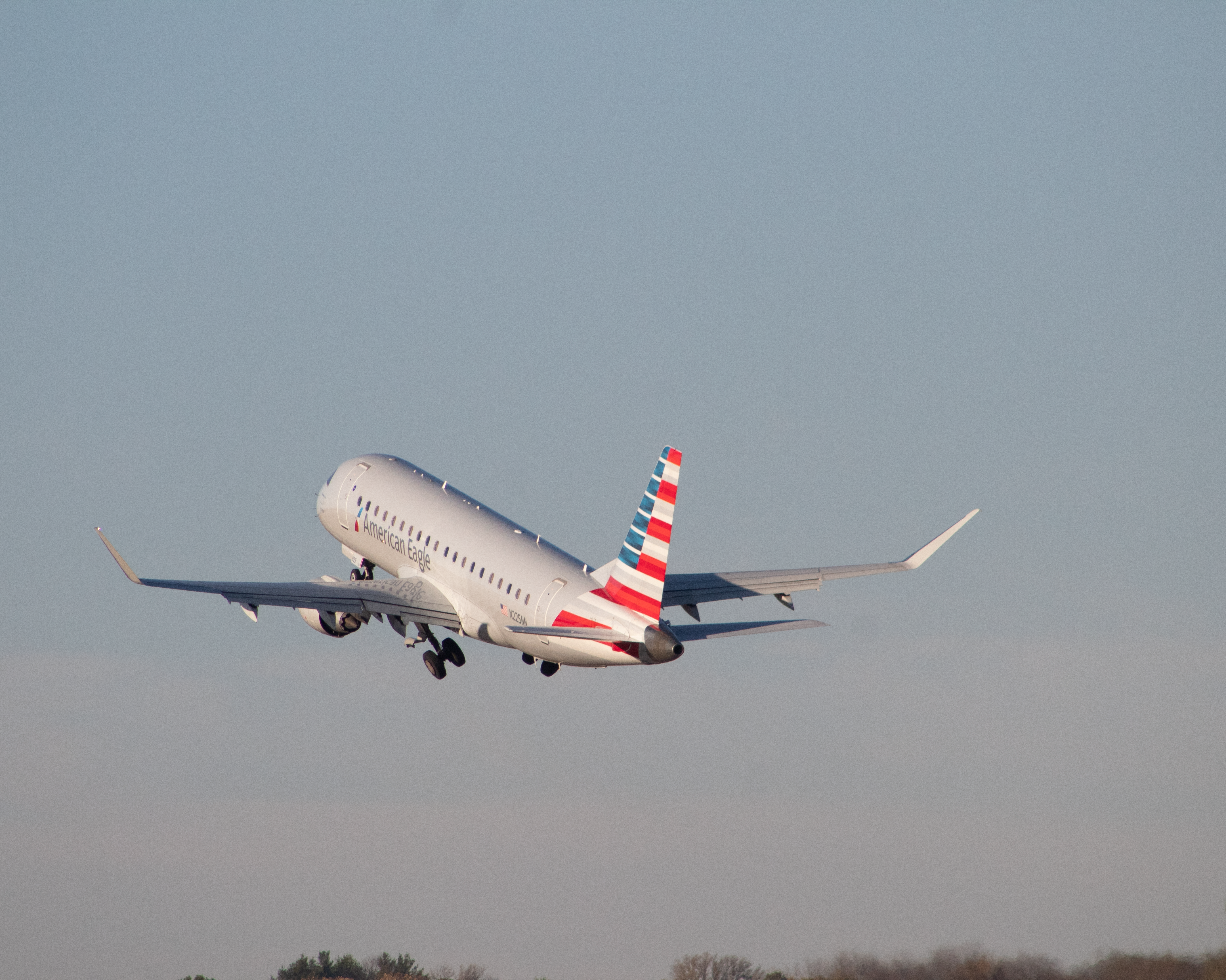
While Helvetica is used by countless companies as their typefaces, including American Airlines (who I work for), I decided to use different fonts. I have nothing against Helvetica, it's a great font, but I've always liked Tahoma, and Gotham stood out quite a bit on my plane model.
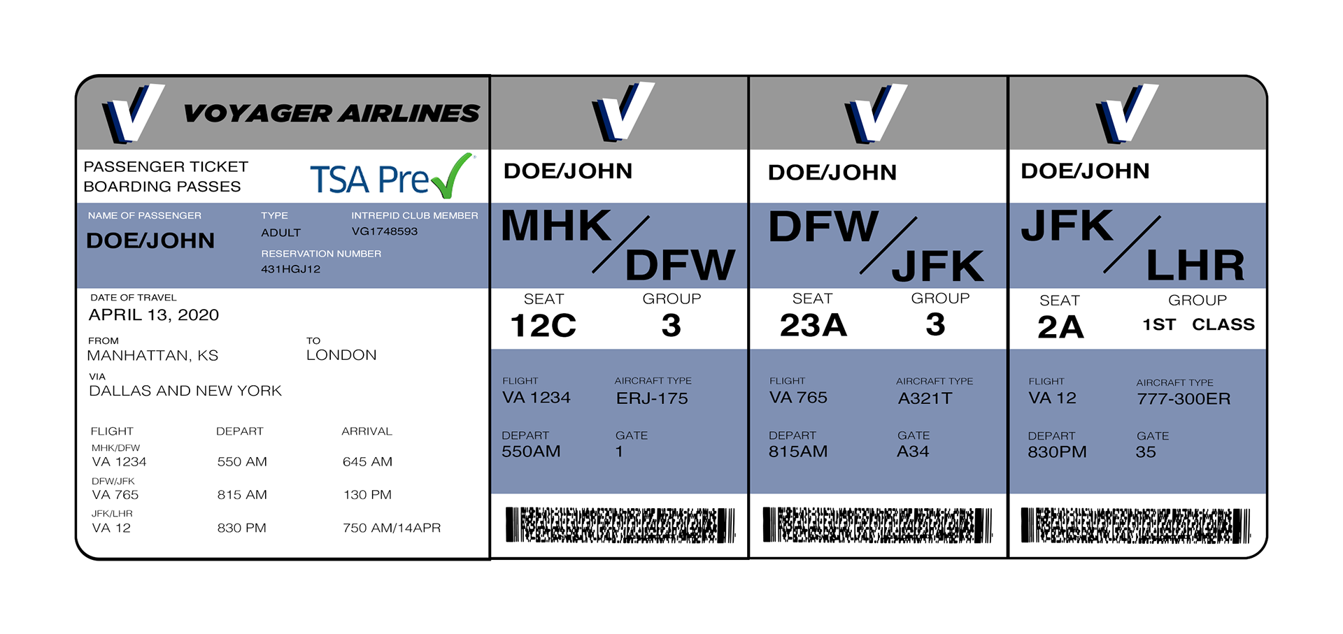
Something I've always felt could be changed are boarding cards, all across various airlines, you get multiple passes. But what if we changed that? What if Voyager could introduce one single boarding card with all your flights on it that you just tear off as you go?

And the safety card. The images are from an American Airlines safety card, and as far as the safety card goes, it's pretty straight forward.